2013. december 22., vasárnap

Google Nexus 5


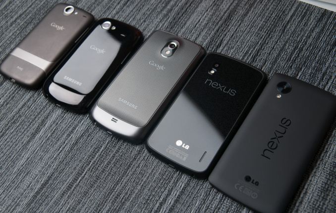
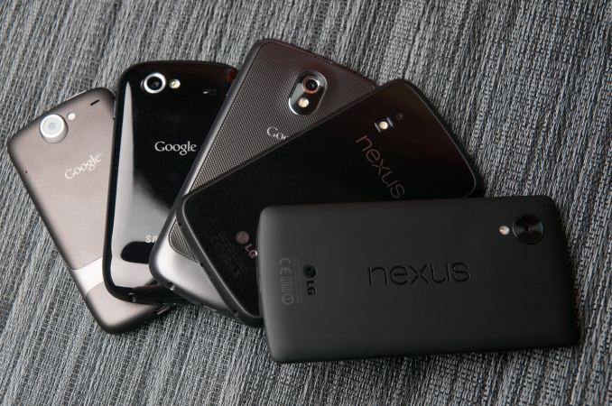
Each year, Google picks a silicon vendor, a hardware partner, and releases a new version of Android running on top of them. The result is a Nexus phone, and for five iterations now that process has repeated, resulting in a smartphone that’s the purest expression of Google’s vision for its mobile platform. Today we’re looking at the Nexus 5.
Nexus 5, as its name makes obvious, is the latest generation of Google’s line of Nexus smartphones, and also is topped by a 5-inch display. While the Nexus program originally started only for smartphones, we’ve seen Google since extend the program to include a 7-inch and 10-inch tablet form factor, as well as a line of accessories. In recent years, we’ve seen Nexus go from being part enthusiast curiosity and development device, to a brand tailored for consumers looking for the latest and greatest the Android platform has to offer at a killer price.
Last generation we saw the Nexus 4, a device that was essentially an LG Optimus G for T-Mobile in different clothing and priced at a competitive price, yet still included the latest and greatest silicon from Qualcomm with APQ8064 (S4 Pro). For Nexus 5, Google has once again gone with hardware partner LG and silicon vendor Qualcomm, this time with a phone that’s somewhat analogous to the LG G2 (but not exactly the same platform) and using the latest and greatest MSM8974 (Snapdragon 800) silicon.
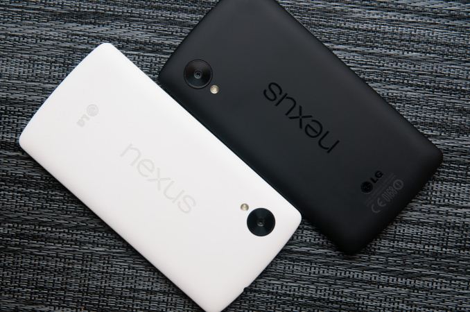
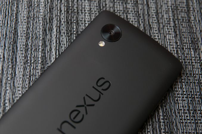
Let’s start with the hardware, since that’s the normal flow for a review. The Nexus 4 bore a lot of superficial similarities to the Optimus G, including a glass back with laser etched design below its surface, the same display, banding, and materials. The Nexus 5 on the other hand doesn’t bear any similarities to the G2, with its buttons on the back, narrow bezel, rounded backside, and glossy plastic. Instead, the Nexus 5’s design borrows much of its industrial design language from the Nexus 7 (2013), with the slightly rounded top and bottom, landscape “nexus” logo on the rear, and large radius curves all around the side. The Nexus 5 and 7 share almost the same shape and profile, and in the case of the black Nexus 5, same rubberized soft touch material on the back and sides. If you scaled down the Nexus 7 design you’d get something which is awfully close to the Nexus 5.
The result is a two-device family that feels like it was made by the same company, and it’s really the first time Google has aligned its industrial design in such a sweeping fashion, in this case even across two different hardware partners. I guess you could make the argument that with the exception of the Nexus 10, Google has eliminated any industrial design fragmentation and finally crafted some hardware design language that it owns for itself.
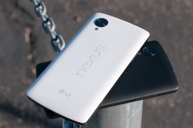
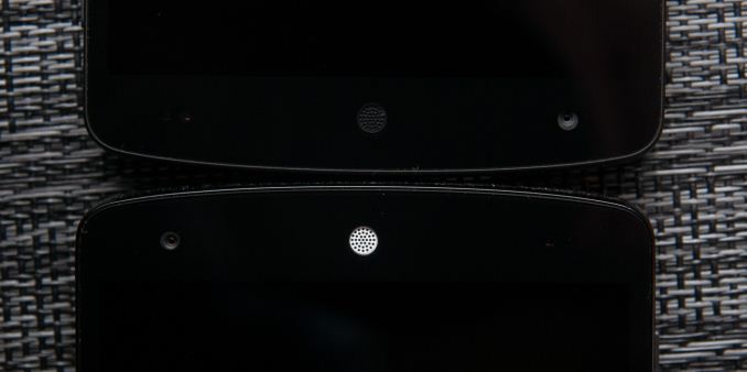
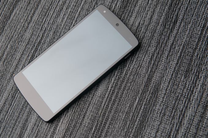
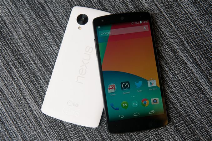
Google sampled us first a black Nexus 5, and later a white Nexus 5 at my request so I could check out the material differences I saw some discussion about. It’s true that there are some differences between the two devices. For starters, the white device has a backside which eschews the soft touch material, instead giving the polymer-backed device a rougher, textured feeling. The absence of soft touch continues to the edge, which is glossy black plastic instead of the rubberized material, and comes with protective plastic installed over it by default. On the front the only visible difference between white and black is a white colored earpiece, the rest of the bezel around the display is still black.
I’m reminded of the split between the white and black Note 3 with the Nexus 5, which also only includes rubberized material on the black model. I find myself preferring the feeling of the white model instead, but it’s really just a story of personal taste. No doubt the absence of soft touch on the white material is to prevent staining from hand oils or other dyes as the device ages. I don’t find that the absence of soft touch on the white model makes it any more difficult to hold or grip onto, the negative-angled bezel really does help the Nexus 5 fit into the hand securely.
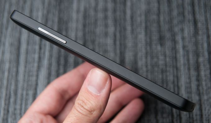
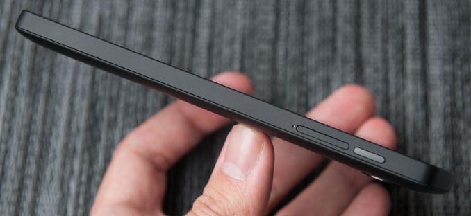
Although the Nexus 5 is a close cousin, it doesn’t adopt the button arrangement from the G2, instead locating the volume and standby buttons in a normal place. Volume rocker ends up on the left, power on the right side.
Likewise earpiece is on top and microUSB is at the bottom of the device. What’s unique about the Nexus 5 buttons is the material of those buttons – they’re ceramic, not polycarbonate. The result is that they’re sharp and instantly locatable with the brush of a finger, it’s a subtle thing that does feel different. The only complaint I have is that they do seem to rattle slightly inside their cutouts. I can affirm that the white model seems to have less rattle, but I’m not entirely sure how much of that is intrinsic to the color difference and absence of soft touch.
Also on the back is the Nexus 5’s oversized camera cutout, which is slightly raised from the surface around it. It’s fair to say that the Nexus 5 does have a camera bump, something that’s not going away soon in all but the most iconic devices. When I first saw the oversized ring, I assumed it was just a design motif, and others later speculated it was for a line of magnetically-attachable add on lenses. To date none of those have materialized, and upon further consideration having magnets next to the VCM (voice coil motor) electromagnetic focus and OIS mechanism could complicate things. In any case, at present the oversized ring around the camera aperture is a unique design point rather than something which serves a function.
The only real negative about the camera cutout is that dust seems to be able to get into the crack surrounding it and the cover glass. It’s something unfortunate about the Nexus 5’s design in general – there are cracks that show dirt quickly, for example the backside has a seam around the edge where dust seems to intrude. It obviously doesn’t change the Nexus 5’s function, but immediately starts looking dirty on the black model, and part of why given both side by side I prefer the white one.
I think pragmatic describes the Nexus 5 design quite well, since honestly the design doesn’t try to be flashy just for the sake of differentiation or make any crazy materials choices on the outside. There are subtle design features which definitely are appreciated, however, like the negative angle to the edge which makes the device easy to grip, those ceramic buttons, and the continuity of design language from the Nexus 7 of course. Materials are a big differentiator between devices right now, and again the Nexus 5 is relatively pragmatic with its choice of polymer, but does deserve kudos for not going with the slick, glossy-surfaced material still preferred by Korean handset makers.
The Nexus 5 feels well made and precision crafted, but I can’t shake the feeling that Nexus 4 felt more like a standout design of its own. The Nexus 5 seems a lot more, well, traditional, without the rounded-glass edges, chrome ring, or pattern below the glass on the back (which I still maintain contained some kind of encoded message). The reality is that Google made a lot of decisions with Nexus to optimize for cost, and that the Nexus 5’s design is actually quite differentiated given the price.
The Nexus 5 adds a lot over its predecessor – larger 1080p display, newer silicon, 802.11ac, better camera with OIS, and of course LTE connectivity, all while getting minimally more expensive than its predecessor. It’s almost unnecessary to say that the Nexus 5 is obviously the best Nexus phone yet.
Physical Comparison
 LG G2Samsung Galaxy Nexus (GSM/UMTS)LG Nexus 4LG Nexus 5
Height138.5 mm135.5 mm133.9 mm137.84 mm
Width70.9 mm67.94 mm68.7 mm69.17 mm
Depth9.14 mm8.94 mm9.1 mm8.59 mm
Weight143 g135 g139 g130 g
CPU2.26 GHz MSM8974
(Quad Core Krait 400)
1.2 GHz OMAP 4460 (Dual Core Cortex A9)1.5 GHz APQ8064 (Quad Core Krait)2.26 GHz MSM8974
(Quad Core Krait 400)
GPUAdreno 330PowerVR SGX 540 @ 304 MHzAdreno 320Adreno 330
RAM2 GB LPDDR31 GB LPDDR22 GB LPDDR22 GB LPDDR3
NAND16/32 GB NAND16/32 GB NAND8/16 GB NAND16/32 GB NAND
Camera13 MP with OIS and Flash (Rear Facing) 2.1 MP Full HD (Front Facing)5 MP with AF/LED Flash, 1080p30 video recording, 1.3 MP front facing8 MP with AF/LED Flash, 1.3 MP front facing8 MP with OIS, AF, LED flash, 1.3 MP front facing
Screen5.2-inch 1920x1080 Full HD IPS LCD4.65" 1280x720 SAMOLED HD4.7" 1280x768 HD IPS+ LCD4.95" 1920x1080 HD IPS LCD
BatteryInternal 11.4 WhrRemovable 6.48 WhrInternal 8.0 WhrInternal 8.74 Whr
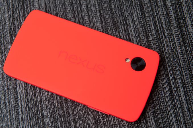
Google also sent over one of the Nexus 5 bumper cases, which really isn’t so much bumper as it is, well, all around case. The Nexus 4 had bumpers that wrapped around the edge, but left the glass back exposed, much like the iPhone 4/4S era bumpers.
Nexus 5’s bumper case covers up everything but the oversized camera aperture on the back. The red one I got doesn’t seem to be silicone but some other thermoplastic.
At $35 it’s a bit on the pricey side, but it does fit the device nicely and get the job done with some cool neon colors that spice up the Nexus 5.
Top 5 PC Games of 2013!

Untitled 2.001
Hey Techfans! 2013 is ending pretty quickly, and one big question that always comes up this time of year in the gaming community is which titles deserve to be Game of the Year. This year saw a lot of great releases on all platforms, with quite a few excellent ones available on PC either exclusively or as part of a multiplatform release, and today I wanted to talk about the 5 big name title games that really stuck out to me this year that I personally enjoyed greatly. This isn’t trying to be a be all end all list of what games were objectively the best hands down this year, but rather just the five games I loved that I’d highly recommend to anyone looking for something good to play.
First off is a title that is technically DLC for another game, but it’s stand alone meaning you can purchase it straight up by itself and enjoy playing without the original, and that’s Far Cry 3: Blood Dragon. Taking the core mechanics of Far Cry 3 and resetting them into an 80’s paradise of movie and cartoon references, Blood Dragon was one of the most hilarious games to come out this year while still providing solid game play. Sure it’s shorter than Far Cry 3 and doesn’t feature the Multiplayer (not that Far Cry 3’s MP was very popular), but in exchange it’s only $15 and a non stop source of laughs.
Going along a similar line another single player FPS that I absolutely loved this year was Bioshock Infinite. Personally I was never a huge fan of Bioshock 2, and was disappointed by the quality of writing it had to offer compared to the 1st, and the change of setting and introduction of new characters offered by Infinite made it into the true sequel I had originally hoped for. Adding in a strong core narrative by adding a companion character with a voiced lead, along with some new mechanics and revised versions of old ones, made Infinite one of the biggest hits of this year. The story may have gotten a tad too convoluted at times, but enough holes are addressed via recordings players can search for leading to a satisfying story line for those that work to finish their games.
Another game I enjoyed this year is technically an expansion pack, but the amount of changes it made to multiplayer and it’s new campaign is enough to compete with certain popular franchises pumping out games every year or two, and that’s Star Craft II: Heart of the Swarm. Alongside revising and expanding the game’s already popular and robust online Multiplayer, HOTS did a great job of also making its’ single player campaign feel unique and engaging. While still featuring unique ways to make better armies than normally allowed in MP, HOTS approached it in a different manner than Wings of Liberty, giving players customization options that were flavored heavily for the Zerg. It also featured a greater number of lite RPG levels focused on just heroes with small armies, and managed to offer a great overall balance of varied and interesting levels.
Next up is a sequal to one of my favorite games of 2011, and both games seem to me to never get the amount of large scale attention they deserve, Rayman Legends. Not only does this game manage to be absolutely gorgeous for a cartoon style game, it also offers a great balance of gameplay that is either difficult when approached in single player, or just straight up silly fun when played in co op with friends. It might look childish to some, but it is by far one of the most concentrated forms of happiness I’ve seen in a game in recent years, and a title I think any remote fan of platformers should give a try. For that matter play Rayman Origins too, it’s only $20 most of the time and you can probably find it on sale too this time of year!
I struggled a bit picking a 5th title for this year, and in the end I decided to go with the one game that absolutely surprised me the most, the reboot of Tomb Raider. It’s not as though I expected it to be a bad game, just that given my history with the franchise and the way it had been going, my hopes hadn’t been set particularly high. After picking it up this assumption had been proven completely wrong. Tomb Raider was a breath of fresh air for the franchise, and while it didn’t do anything particularly innovative for it’s genre, it did a fantastic job of balancing platforming, third person shooting, and melee combat. My only real complaint with the single player campaign is that my absolute favorite part of it was somewhat low in supply: the side dungeon puzzles which featured great platforming puzzle design. It’s multiplayer wasn’t anything to write home about, but it did nothing to detract from how much I found myself enjoying the single player. So those were my picks for top 5 games of 2013, this list is by no means the definitive one, as everyone has different tastes and there were a lot of great titles to choose from this year. Thanks for reading and make sure to let us know your picks for this year in the comments!

NVIDIA G-Sync


It started at CES, nearly 12 months ago. NVIDIA announced GeForce Experience, a software solution to the problem of choosing optimal graphics settings for your PC in the games you play. With console games, the developer has already selected what it believes is the right balance of visual quality and frame rate. On the PC, these decisions are left up to the end user. We’ve seen some games try and solve the problem by limiting the number of available graphical options, but other than that it’s a problem that didn’t see much widespread attention. After all, PC gamers are used to fiddling around with settings - it’s just an expected part of the experience. In an attempt to broaden the PC gaming user base (likely somewhat motivated by a lack of next-gen console wins), NVIDIA came up with GeForce Experience. NVIDIA already tests a huge number of games across a broad range of NVIDIA hardware, so it has a good idea of what the best settings may be for each game/PC combination.
Also at CES 2013 NVIDIA announced Project Shield, later renamed to just Shield. The somewhat odd but surprisingly decent portable Android gaming system served another function: it could be used to play PC games on your TV, streaming directly from your PC.
Finally, NVIDIA has been quietly (and lately not-so-quietly) engaged with Valve in its SteamOS and Steam Machine efforts (admittedly, so is AMD).
From where I stand, it sure does look like NVIDIA is trying to bring aspects of console gaming to PCs. You could go one step further and say that NVIDIA appears to be highly motivated to improve gaming in more ways than pushing for higher quality graphics and higher frame rates.
All of this makes sense after all. With ATI and AMD fully integrated, and Intel finally taking graphics (somewhat) seriously, NVIDIA needs to do a lot more to remain relevant (and dominant) in the industry going forward. Simply putting out good GPUs will only take the company so far.
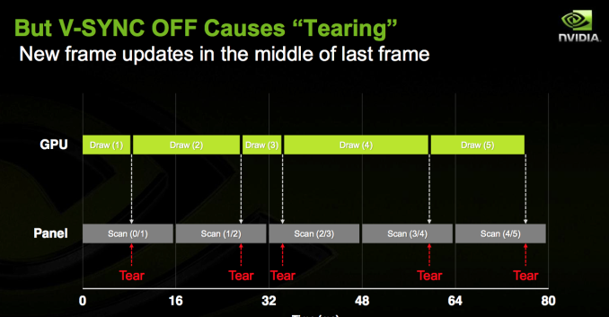
NVIDIA’s latest attempt is G-Sync, a hardware solution for displays that enables a semi-variable refresh rate driven by a supported NVIDIA graphics card. The premise is pretty simple to understand. Displays and GPUs update content asynchronously by nature. A display panel updates itself at a fixed interval (its refresh rate), usually 60 times per second (60Hz) for the majority of panels. Gaming specific displays might support even higher refresh rates of 120Hz or 144Hz. GPUs on the other hand render frames as quickly as possible, presenting them to the display whenever they’re done.
When you have a frame that arrives in the middle of a refresh, the display ends up drawing parts of multiple frames on the screen at the same time. Drawing parts of multiple frames at the same time can result in visual artifacts, or tears, separating the individual frames. You’ll notice tearing as horizontal lines/artifacts that seem to scroll across the screen. It can be incredibly distracting.
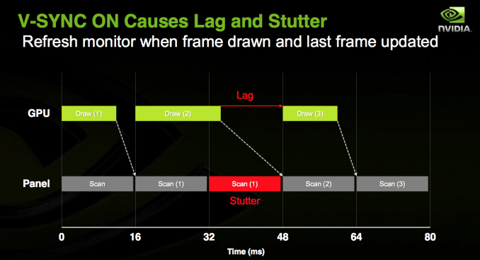
You can avoid tearing by keeping the GPU and display in sync. Enabling vsync does just this. The GPU will only ship frames off to the display in sync with the panel’s refresh rate. Tearing goes away, but you get a new artifact: stuttering.
Because the content of each frame of a game can vary wildly, the GPU’s frame rate can be similarly variable. Once again we find ourselves in a situation where the GPU wants to present a frame out of sync with the display. With vsync enabled, the GPU will wait to deliver the frame until the next refresh period, resulting in a repeated frame in the interim. This repeated frame manifests itself as stuttering. As long as you have a frame rate that isn’t perfectly aligned with your refresh rate, you’ve got the potential for visible stuttering.
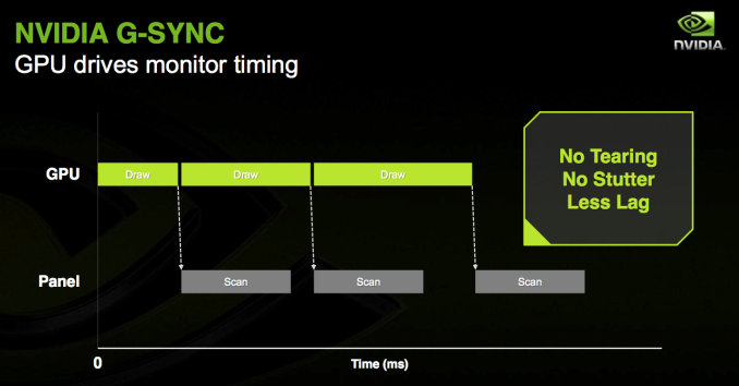
G-Sync purports to offer the best of both worlds. Simply put, G-Sync attempts to make the display wait to refresh itself until the GPU is ready with a new frame. No tearing, no stuttering - just buttery smoothness. And of course, only available on NVIDIA GPUs with a G-Sync display. As always, the devil is in the details.

How it Works

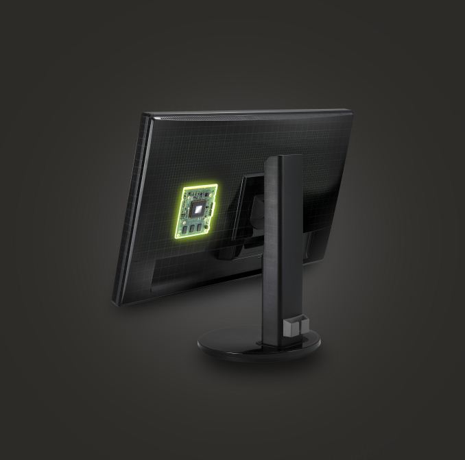
G-Sync is a hardware solution, and in this case the hardware resides inside a G-Sync enabled display. NVIDIA swaps out the display’s scaler for a G-Sync board, leaving the panel and timing controller (TCON) untouched. Despite its physical location in the display chain, the current G-Sync board doesn’t actually feature a hardware scaler. For its intended purpose, the lack of any scaling hardware isn’t a big deal since you’ll have a more than capable GPU driving the panel and handling all scaling duties.
G-Sync works by manipulating the display’s VBLANK (vertical blanking interval). VBLANK is the period of time between the display rasterizing the last line of the current frame and drawing the first line of the next frame. It’s called an interval because during this period of time no screen updates happen, the display remains static displaying the current frame before drawing the next one. VBLANK is a remnant of the CRT days where it was necessary to give the CRTs time to begin scanning at the top of the display once again. The interval remains today in LCD flat panels, although it’s technically unnecessary. The G-Sync module inside the display modifies VBLANK to cause the display to hold the present frame until the GPU is ready to deliver a new one.
With a G-Sync enabled display, when the monitor is done drawing the current frame it waits until the GPU has another one ready for display before starting the next draw process. The delay is controlled purely by playing with the VBLANK interval.
You can only do so much with VBLANK manipulation though. In present implementations the longest NVIDIA can hold a single frame is 33.3ms (30Hz). If the next frame isn’t ready by then, the G-Sync module will tell the display to redraw the last frame. The upper bound is limited by the panel/TCON at this point, with the only G-Sync monitor available today going as high as 6.94ms (144Hz). NVIDIA made it a point to mention that the 144Hz limitation isn’t a G-Sync limit, but a panel limit.
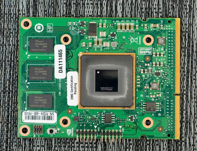
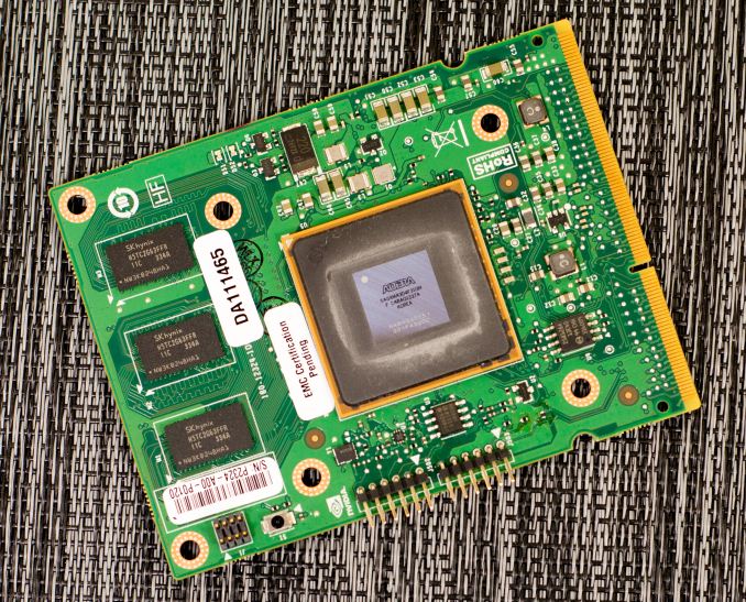
The G-Sync board itself features an FPGA and 768MB of DDR3 memory. NVIDIA claims the on-board DRAM isn’t much greater than what you’d typically find on a scaler inside a display. The added DRAM is partially necessary to allow for more bandwidth to memory (additional physical DRAM devices). NVIDIA uses the memory for a number of things, one of which is to store the previous frame so that it can be compared to the incoming frame for overdrive calculations.
The first G-Sync module only supports output over DisplayPort 1.2, though there is nothing technically stopping NVIDIA from adding support for HDMI/DVI in future versions. Similarly, the current G-Sync board doesn’t support audio but NVIDIA claims it could be added in future versions (NVIDIA’s thinking here is that most gamers will want something other than speakers integrated into their displays). The final limitation of the first G-Sync implementation is that it can only connect to displays over LVDS. NVIDIA plans on enabling V-by-One support in the next version of the G-Sync module, although there’s nothing stopping it from enabling eDP support as well.
Enabling G-Sync does have a small but measurable performance impact on frame rate. After the GPU renders a frame with G-Sync enabled, it will start polling the display to see if it’s in a VBLANK period or not to ensure that the GPU won’t scan in the middle of a scan out. The polling takes about 1ms, which translates to a 3 - 5% performance impact compared to v-sync on. NVIDIA is working on eliminating the polling entirely, but for now that’s how it’s done.
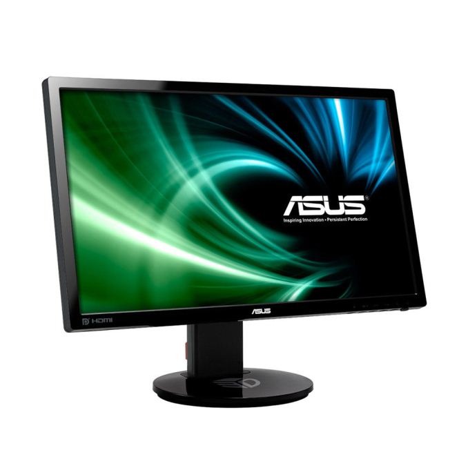
NVIDIA retrofitted an ASUS VG248QE display with its first generation G-Sync board to demo the technology. The V248QE is a 144Hz 24” 1080p TN display, a good fit for gamers but not exactly the best looking display in the world. Given its current price point ($250 - $280) and focus on a very high refresh rate, there are bound to be tradeoffs (the lack of an IPS panel being the big one here). Despite NVIDIA’s first choice being a TN display, G-Sync will work just fine with an IPS panel and I’m expecting to see new G-Sync displays announced in the not too distant future. There’s also nothing stopping a display manufacturer from building a 4K G-Sync display. DisplayPort 1.2 is fully supported, so 4K/60Hz is the max you’ll see at this point. That being said, I think it’s far more likely that we’ll see a 2560 x 1440 IPS display with G-Sync rather than a 4K model in the near term.
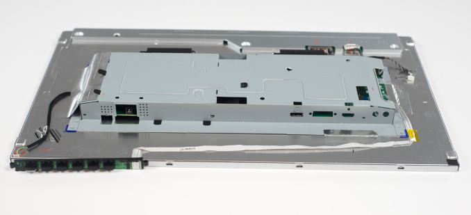
Naturally I disassembled the VG248QE to get a look at the extent of the modifications to get G-Sync working on the display. Thankfully taking apart the display is rather simple. After unscrewing the VESA mount, I just had to pry the bezel away from the back of the display. With the monitor on its back, I used a flathead screw driver to begin separating the plastic using the two cutouts at the bottom edge of the display. I then went along the edge of the panel, separating the bezel from the back of the monitor until I unhooked all of the latches. It was really pretty easy to take apart.
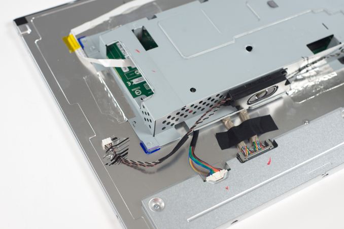
Once inside, it’s just a matter of removing some cables and unscrewing a few screws. I’m not sure what the VG248QE looks like normally, but inside the G-Sync modified version the metal cage that’s home to the main PCB is simply taped to the back of the display panel. You can also see that NVIDIA left the speakers intact, there’s just no place for them to connect to.
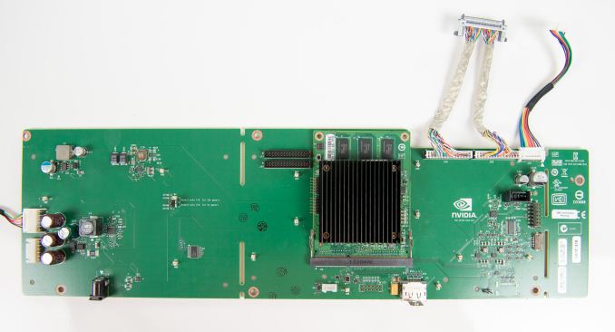
It looks like NVIDIA may have built a custom PCB for the VG248QE and then mounted the G-Sync module to it.
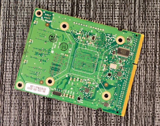
The G-Sync module itself looks similar to what NVIDIA included in its press materials. The 3 x 2Gb DDR3 devices are clearly visible, while the FPGA is hidden behind a heatsink. Removing the heatsink reveals what appears to be an Altera Arria V GX FPGA. 
The FPGA includes an integrated LVDS interface, which makes it perfect for its role here.